Making Visualizations
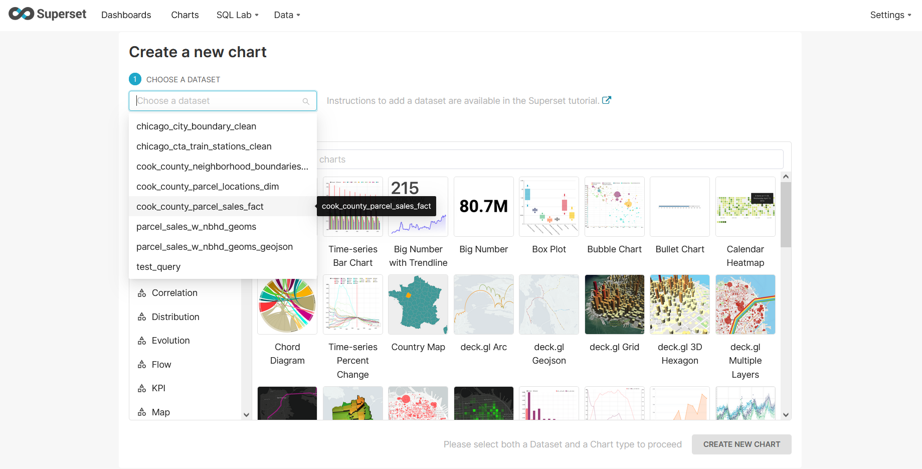
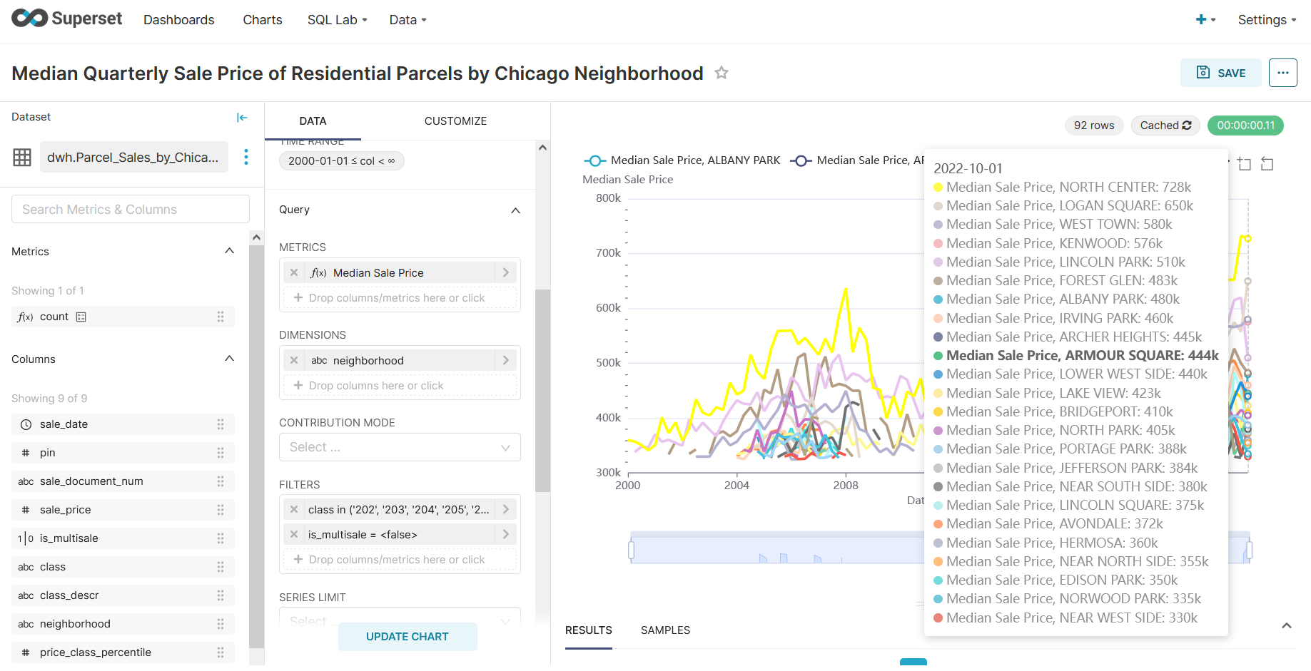
Create (via the Superset SQL Lab) or select a data set and select a chart type to visualize that data set.
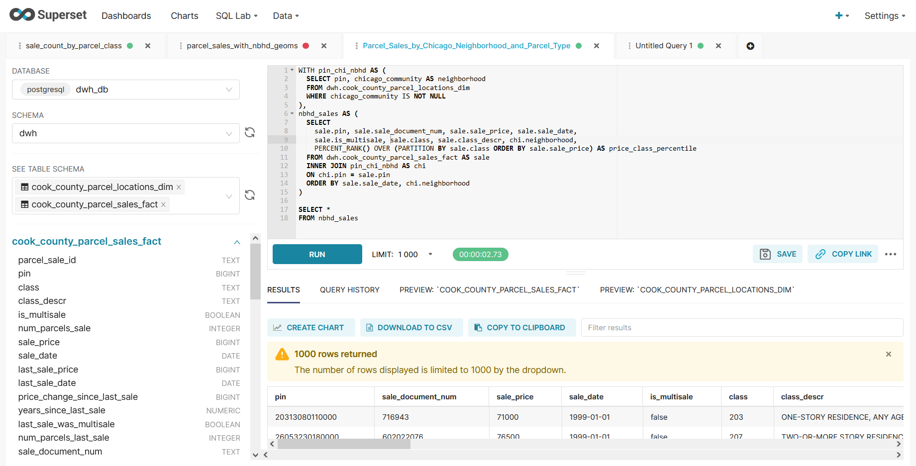
Select dimensions to group data by and metrics to visualize for those groupings.
Metrics can be basic aggregations like MIN, MAX, COUNT, COUNT_DISTINCT, AVG, or SUM, or you can define custom aggregations from one or more column.
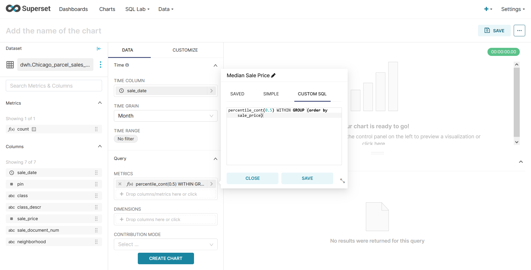
Filter data to a meaningful subset.
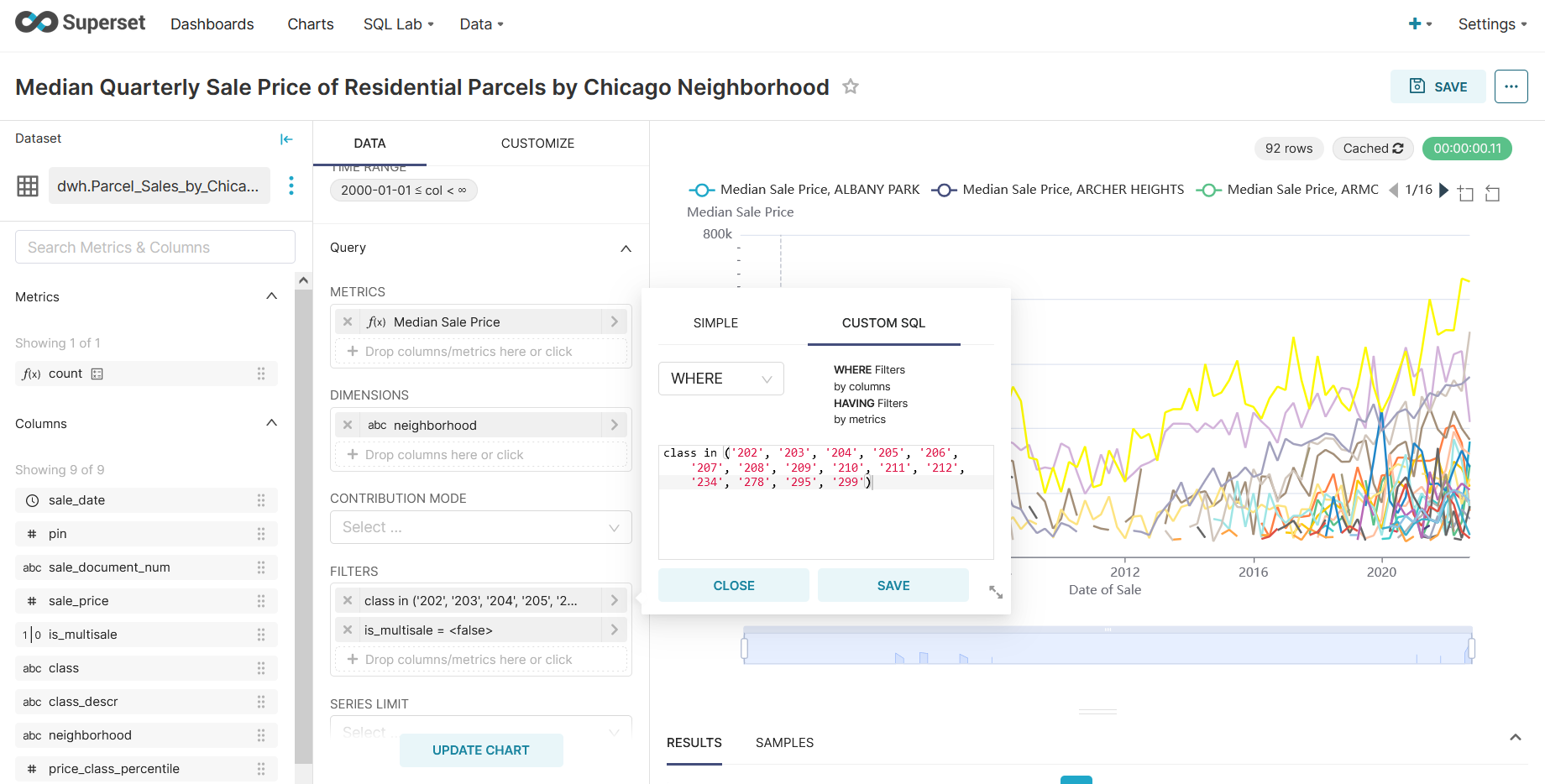
Format titles, labels, tooltips, timespan slicing, etc.
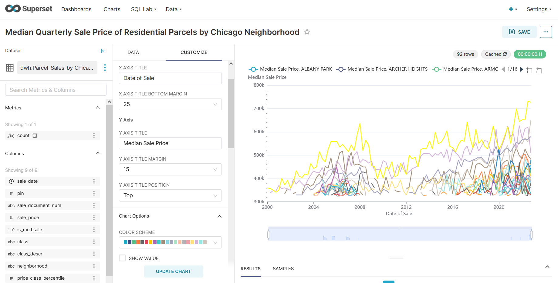
And when the chart is finished, save the visualization (via the save button in the upper right corner). Now the chart is ready to to add to a dashboard.
Resources
Explore this tutorial for more on visualizing data in Superset. Preset also provides walkthroughs for many other chart types available in Superset.